Living in the zone
By Burkard Polster and Marty Ross
The Age, 19 May 2008
Fortunate art thou who liveth in The Zone. What zone? The neighbourhood school zone of Glen Waverley Secondary School (GWSC), in Eastern Melbourne. Those residing in The Zone are able to attend a government school that, in reputation and results, rivals the prestigious (and expensive) private schools.
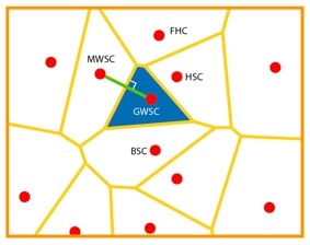
If you don’t live in THE Zone, you still live in some zone, for some school. This means that the children in your family must (usually) be accepted by that school. The diagram shows the schools and the zones close to Glen Waverley.
The zone of a given secondary school includes those homes that are closer to this school than any other secondary school (as the crow flies). It is a very geometric definition, with geometric consequences. For example, the border of a zone must consist of straight lines. In fact, joining the two schools in adjacent zones by a straight line, the common boundary of these zones is the perpendicular bisector of this connecting line.
Drawing such perpendicular bisectors, it is easy to construct a complete zone map for the schools in a given area. The end result will always be similar to our diagram. In particular, all zones will be convex, which gives the resulting map its characteristic crystalline appearance.
Together, the boundaries of the secondary school zones form a special sort of network called a Voronoi diagram. Voronoi diagrams are useful in many different contexts. For example, a Pizza Chain can use a diagram to assign a delivery order to the closest branch. More scientifically-minded: meteorologists use Voronoi diagrams associated with weather stations to estimate regional rainfall averages; chemists use them to model crystal growth; and zoologists use them to model the territories of animals.
A famous and brilliant application of Voronoi diagrams is due to the British physician John Snow, who solved the mystery of how cholera is spread. In 1854, during the London cholera epidemic, Snow drew a Voronoi diagram associated with the water pumps in the Soho area. Importantly, Snow used travel times to the pumps, rather than straight-line distances. (Shall we stir up a hornet’s nest and suggest that Melbourne school zones should be determined by a similar method?) Snow demonstrated that most victims of the epidemic lived closest to the Broad Street water pump. This gave compelling evidence that the water at this pump was itself the source of the cholera.
Voronoi diagrams can also be applied in an inverse manner. Suppose, for example, that you want to live in the Eastern Melbourne region we have mapped above, but that you really hate schools. Where should you buy your house to maximize the distance to the nearest secondary school? The Voronoi diagram shows that you need only consider 26 spots: the 14 corners of the zones; the four corners of the map; and the 8 points where the zone edges meet the map edges. That’s a lot quicker than checking every house on every street.
This last example may seem a bit far-fetched. But, if you’re in a region with a number of toxic dumps, or nuclear sites, or other nasties, a suitable Voronoi diagram could be very desirable.
Copyright 2004-∞ ![]() All rights reserved.
All rights reserved.